Posted by Axel McCarthy
Today we launched our newest theme, Edifice. This theme contains a lot of features that you, our customers, told us you wanted. It's got right-hand navigation, and the site banner is kept small in the upper left corner. Sections and buttons are rendered as elegant rounded rectangles. And, of course, you can choose your own colors and fonts. We think it looks great.
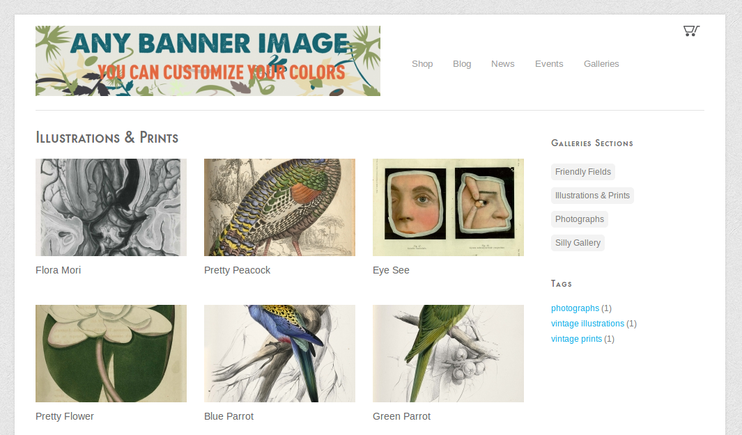
For gallery pictures and products, we've made the images quite large, and they're never cropped.
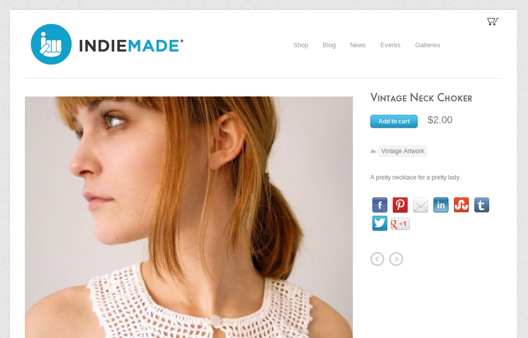
Another nice feature of Edifice is that the page background is an abstract texture. You can select from any of a few dozen professionally made textures to personalize your look.
.png)
For a live demo, check out http://edifice.indiemade.com.
As with all our themes, you can try it out on your own IndieMade site without fear. Switching themes doesn't ever destroy your data, and you can switch back to your existing theme whenever you like — your color and font choices will be exactly as they were before.
Let us know what you think of the new theme!

