Posted by Axel McCarthy
Today we're announcing two new features that we released to the IndieMade network over the last few weeks: a new, responsive theme for the dashboard; and a new responsive theme for sites called Leaf.
A Responsive Dashboard
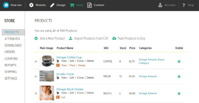
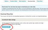
IndieMade customers use their dashboards to update their sites: to add and edit pages, post to their blog, update products, manage orders, and a host of other tasks. Our usage statistics show that 90% of the time our customers use their desktop browsers to do this -- but a vocal minority wants to be able to edit their sites on the go. So we've designed and released an updated dash to allow them to do precisely that.
The basic navigation is the same as with the previous dashboad: there are main categories for website, design, store, and content. Clicking on one of the main elements brings up a sub-menu. This sub-menu is now shown to the left of the dashboard proper. And the main body of the dashboard has been re-themed, too, with easier to read fonts, more informational graphical elements, and so on.
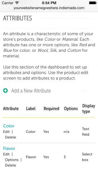
If you log into your dashboard from your phone or tablet, the IndieMade service will automatically recognize this and will reconfigure itself for maximal ease of use. So if you're at UPS shipping your packages out, you can log into your site and mark the orders as Completed right there. Pretty cool.
Introducing Leaf
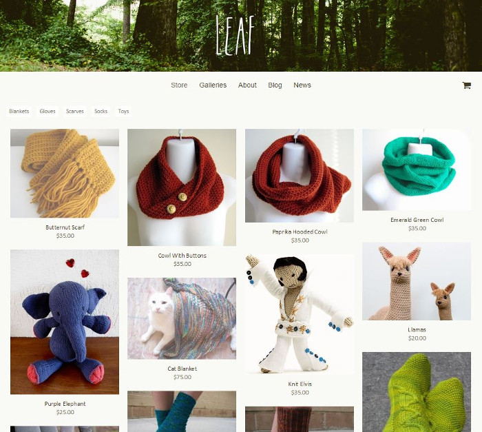
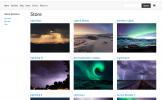
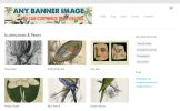
Our other announcement is a new responsive theme, Leaf. It's available for all IndieMade stores right now, from the design > themes tab of the dashboard.
Leaf is different from our other themes in two ways.
First, it has no specific page background. The content of the site (pages, blog posts, gallery images, the shopping cart, and so on) is all displayed directly on the background, which extends out to cover the viewport. (Of course you can change the background color, use an abstract tile that we provide, or upload your own graphic for yoru own distinctive look.)
Second, images for the store, galleries, and news items are arranged in a Pinterest-style layout based on the height of the image and the available vertical space. Change the size of the browser window and you see a groovy reordering effect while the images are re-arranged.
Leaf is responsive, too, which means that people using mobile phones or tablets will see a different view of the site than those using a traditional desktop browser.
We're excited about the new theme, and hope that you are too. Check out leaf for yourself at our demo site, http://leaf.indiemade.com.

